Run Monitor
How I keep track of my run training
In October I am running a half marathon. I am training for this event since a couple of weeks and my goal is to run 21.1 kilometres in 2 hours or less. The training is going pretty well so far, however, I think that every averagely athletic person can finish a half marathon. So, the difficulty is not to accomplish it at all, but to achieve a good time and to be not too destroyed afterwards.
Since I never did regular run training before, I had to obtain a feeling for pace and distance. Me and my training partner use an app with GPS tracking that records our track and offers basic measurements. Each time we go out for a run, we check the values and try to figure out, how our training session compares to our goal: How long was that run in relation to the full distance? How fast did we run? If we would run with this pace over the entire distance, then what would our target time be?
Not for nothing am I a software developer, so the answer to these questions is quite predictable: I built an app. It’s basically a dashboard that spits out the data and renders charts, which help us to understand and keep track of our training progress. The idea is to put the data into relation to an actual half marathon and get a good feel for where we currently are. The data itself (mainly distance and time, and also a few meta information) is held in Contentful and has to be entered by hand after each run.
Enough of the words: make mincemeat out of my run performance and go visit the dashboard yourself.1
Information design
Designing this tiny dashboard app was actually pretty fun, as I put a lot of thought in the information design. As I explained above, the key idea is to have a comprehensive and intuitive comparison of one particular training session to the goal of running 21.1 km in 2 hours. There are four measurements:
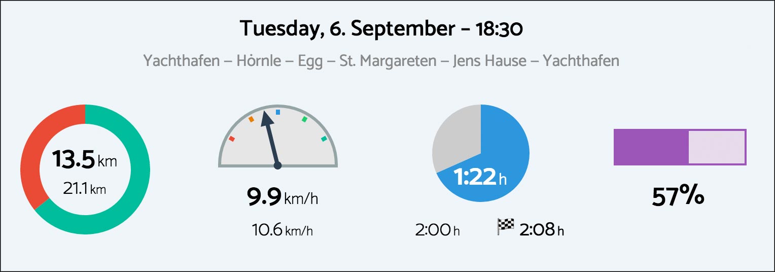
Distance
For visualizing the distance I chose a ring chart (which technically is a pie chart with a cut out inner circle). The green part shows how long the run was and the red part represents the remaining distance to the full 21.1 km. The diagramm is basically a ring, which reminds you of a circuit track.
Pace
The pace is depicted by a speedometer. The symbolic mapping is quite obvious here. The rest position of the needle is in the middle and a deviation to the right or to the left shows whether we were too slow or whether we “overperformed”. The colors of the scale emphasize the amplitude and add additional clarity on how this chart is to be read.
Time
The time consumption is set into relation to the target time of 2 hours and is visualized by a pie chart. This is a good choice, since the shape of the chart is faintly reminiscent of the face of a clock. In addition to the target time, this widget also displays the estimated finish time. This is the calculated overall time that would result if we would have kept our pace over the whole distance.
Intensity
This is an analytical value, that is admittedly not obvious at all. The idea here is to have a single value that gives some indication of the overall intensity. In the end, both distance and pace influence the level of exhaustion of one run. It is an answer to the question how a short but quick run compares to a long but slow one.2 Since the value is to be considered a mere indicator, I used a progress bar that is quite narrow and thereby vaguely to be read off. This is a conscious design choice, since the chart should not convey a precision that is not existing.
These features are missing
Since this is just a one-day project that I produced for myself in the first place, I had to make a cut and omit certain features. If I would invest more time into this project, I would work on a few further tasks, such as:
- The accessability (a11y) must be improved. I don’t know how colorblind people would deal with the widgets. Also, there are no hidden labels, that would make the data accessible in screen readers.
- I treat the backend data as it were totally safe. There is no input validation and some edge cases are not covered. Let’s say you run super fast at a 16 km/h pace: If you enter this data, the corresponding graph would look pretty funny.
- It would be nice if you could choose how to sort the data. At the moment the data is ordered by date, which is a hardcoded behaviour. Also, it would be interesting to apply filters.
- There are some issues in IE10 and probably a few other (older) browsers… (sigh)